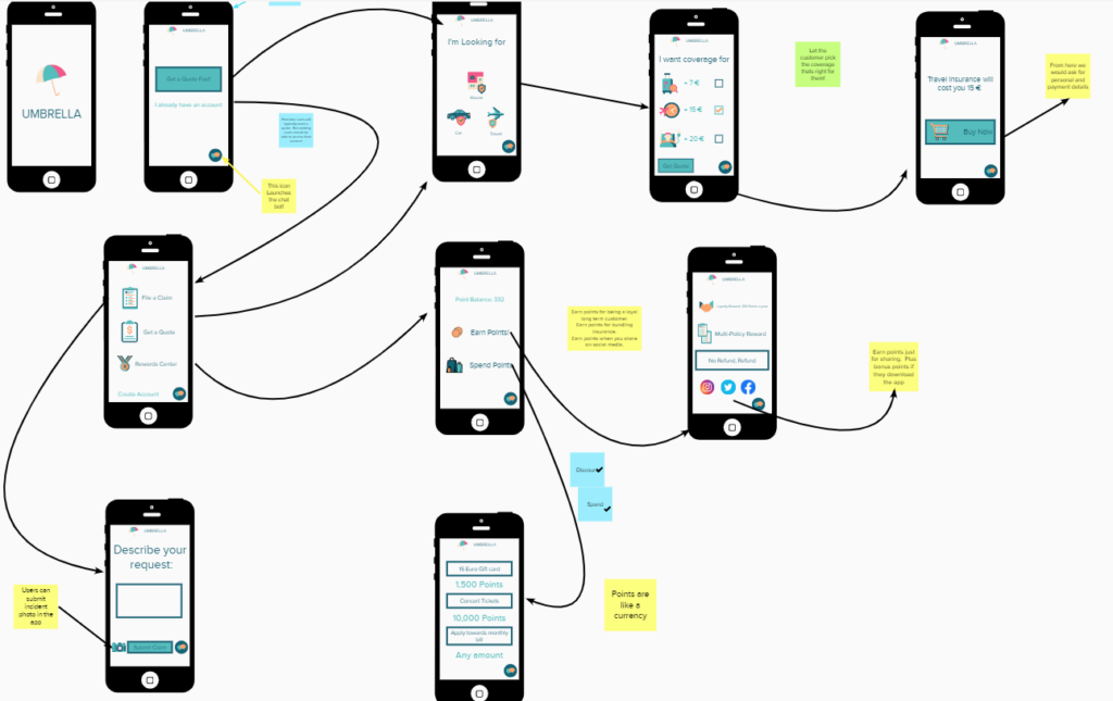
Moving into the Prototype phase we decided the best way to communicate our idea would be to create a Wireframe of the app. A Wireframe is a diagram of the app. It could also be referred to as a storyboard or a map. The Wireframe shows how each screen within the app would connect to each other.
The Americans got together Wednesday evening and began sketching out the wireframe. We wanted to create an app that would be simple to understand and give a smooth user experience. But we also wanted to communicate a lot of information.
Key Design Choices:
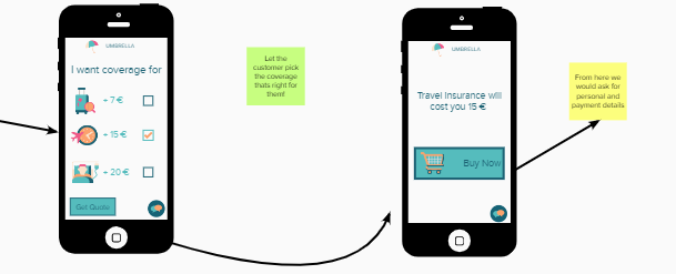
We allowed uses to break out there insurance policy into the underlying components and select the coverage that was right for them. We also felt it was important that users be able to see the price before they created an account.
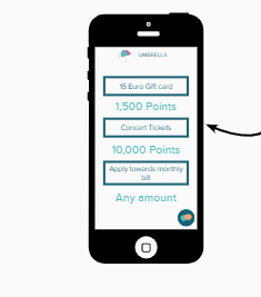
The group experienced some conflict when designing the rewards center. Some of us felt building out a complicated rewards center would confuse customers and move away from our core competencies. In the end we opted to keep it in as it added an element of gamification, and made the app more sharable.
